Designing for Print vs Web: Understanding the Differences in Graphic Design
Designing for print vs web are two distinct disciplines within graphic design. While there are similarities, there are also key differences that designers need to understand to create effective designs for each medium. Here are some important factors to consider when designing for print and web:
The Right Medium
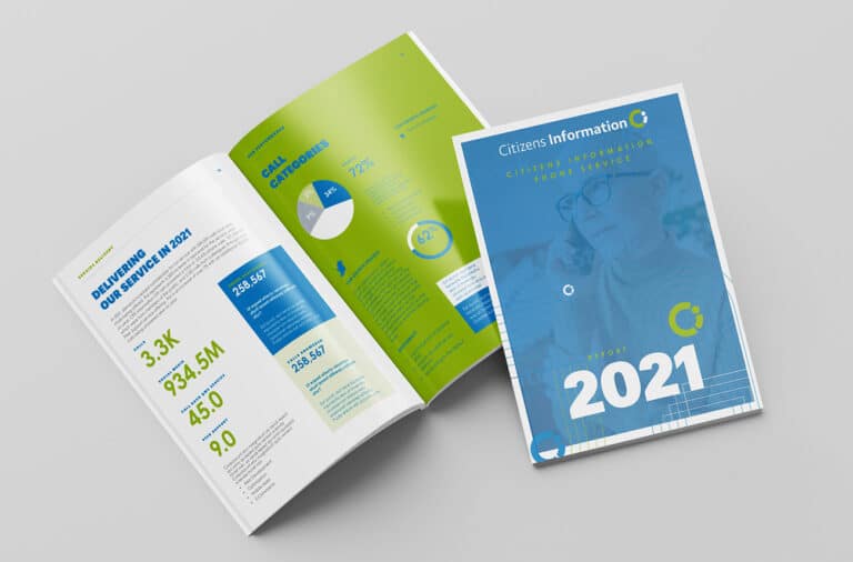
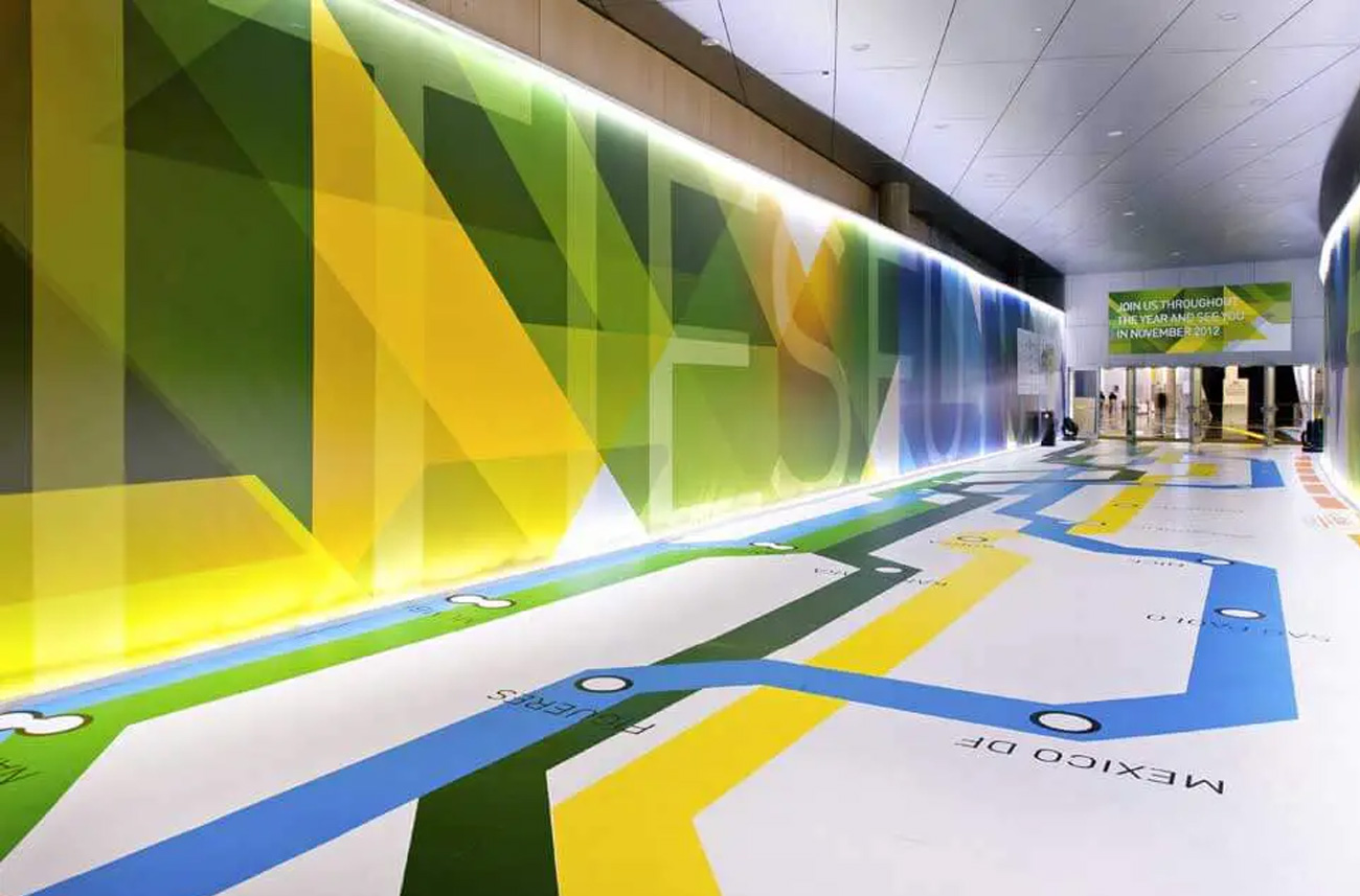
Print: Designs for print are intended for physical distribution and are viewed on tangible surfaces like paper, magazines, brochures, or billboards. The size and dimensions of the printed material are fixed.
Web: Designs for the web are meant to be viewed on digital devices such as computer screens, tablets, and smartphones. The size and resolution can vary based on the device and screen size.
Colour Mode
Print: CMYK (Cyan, Magenta, Yellow, Black) is the standard colour mode for print. Printers use a combination of these four colours to produce a wide range of shades and tones.
Web: RGB (Red, Green, Blue) is the standard colour mode for the web. Digital devices emit light, and RGB colours are created by combining these three primary colors of light.
Resolution
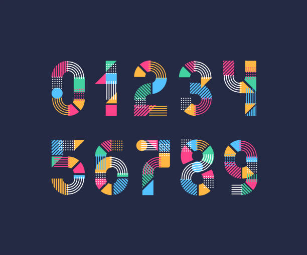
Print: Print requires high-resolution images (usually 300 dpi or higher) to ensure crisp and clear output on paper.
Web: Web designs are created at a lower resolution (usually 72 dpi) to optimize file sizes for faster loading times on websites. Images with higher resolutions can slow down web page loading. When designing for print vs Web you need to keep this in mind.
Typography
Print: In print design, graphic designers have more freedom in font choices. They can use a wide variety of typefaces, including those that require licensing fees. Print typography can be more intricate and detailed.
Web: Web design requires careful font selection from web-safe fonts, which are pre-installed on most devices to ensure consistent display across different platforms. Web fonts can still be customized, but the choices are more limited.
Layout and Grids
Print: Print layouts are often more static and precise. Designers have more control over exact placement, margins, and grids to achieve a polished and predictable look.
Web: Web layouts are fluid and responsive, adapting to different screen sizes and orientations. Designers use grids and responsive design principles to ensure the content is presented well on various devices.
Conclusion
Understanding these key differences between designing for print and web allows graphic designers to tailor their creations to the specific medium and optimize the user experience for each platform.


